Why Music Search System?
Music, in today’s world, is one form of digital information that has a significant emotional value for the user. It is a form of information that most human beings are interested in exploring most of the times, apart from searching individual tracks. Internet radio, hence, has become a very popular means of accessing music.
The systems explored in this analysis, SoundCloud and Rdio are both internet-radio platforms, SoundCloud being an old favorite of many users and Rdio being a recent competitor to it. Both these systems offer an aesthetically appealing interface and have worked extensively on the user experience. Throughout my analysis, I would be exploring how one interface is better than the other using the criteria of Effectiveness, Efficiency, Mental effort and Cognitive load, Usefulness and User Engagement.
Evaluation Criteria
Throughout my analysis, I would be exploring how one interface is better than the other using the criteria of Effectiveness, Efficiency, Mental effort and Cognitive load, Usefulness and User Engagement.
Effectiveness
User
Efficiency
Cognitive
Load
Surrogate
Usefulness
User
Engagement
System Description
SoundCloud | SoundCloud is one of the most popular internet-radio services. While, it allows users to listen to music by established artists, it also includes music from new artists and allows users to recommend their music. Hence, the userbase of SoundCloud is very large and comprises of music creators, who promote their music online and music listeners, who look for new and old artists and their songs.
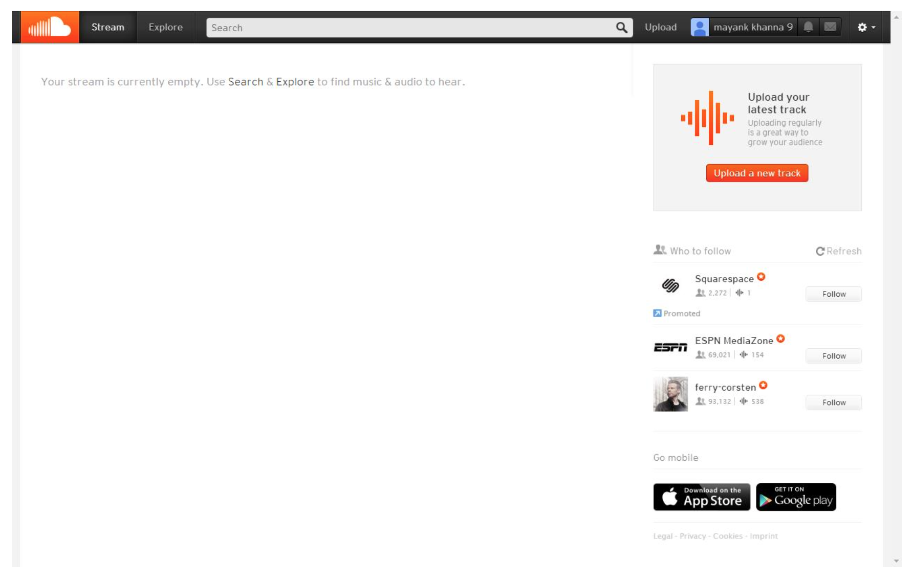
The main page of the platform, as seen below, does not include any results by default, as it expects the user to follow some artists to get results in the feed. It thus, suggests search as the primary function of discovering music the user is interested in. The system incorporates a coherent color scheme and is very aesthetically appealing. The system also incorporates a prominent search bar that motivates the user to make a search query for the music they are looking for.

Rdio| Rdio is another internet-radio service that has become a recent competitor of SoundCloud. It is also a very popular service but is available for use in fewer countries and hence, does not have a userbase as large as SoundCloud. Rdio is limited in functionality compared to SoundCloud as it does not allow new music creators to upload their music and mainly includes music from popular artists on its platform.
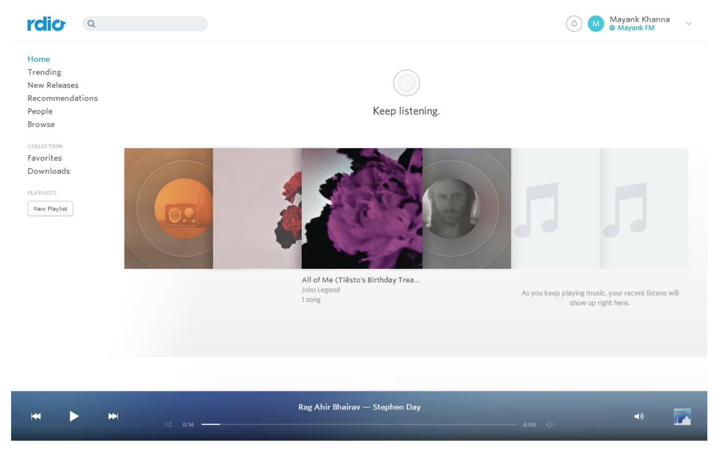
The interface as shown below, shows previously played tracks as suggestions to the users. The suggestive tracks are a useful feature as the user might be interested in listening to the same track that the user played earlier and hence, evokes higher user engagement with the platform. The Rdio interface also follows a coherent color scheme and is aesthetically appealing. Rdio also includes a search-bar in the header but is not as prominent in presence as the one in SoundCloud interface and hence, is not very motivating for the user to search for music as the very first step.

User Tasks & Behavior
In order to assess the two platforms, the following tasks were formulated
Task 1 | Search your favorite song (Simple)
As an avid music listener, the user had recently formed liking for a particular song “All of me” by the artist John Legend and kept listening to it very frequently. So the user just needed to search for that particular music track, look for the particular result in the search results and play that track.
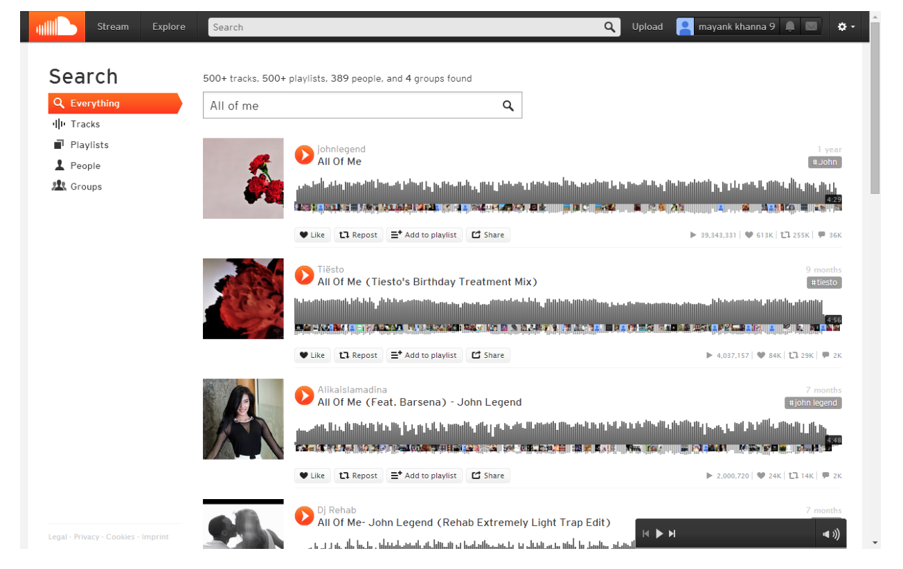
In case of SoundCloud, the user used the search bar to search for the words “All of me” and come across a set of results, as shown in the image below. The play button is strikingly highlighted in the surrogates. The user analyzed the first search result to suit his interests and hence play the track by clicking the play button in the surrogate.

In case of Rdio, the user searched for the track “All of me” and came across the set of search results as shown in the image below. He analyzed the first result to resemble what he was looking for, and attempted to click on the result, only to realize that the play button appeared on hover and then moved the cursor to play the song.

Task 2 | Explore music based on Genre (Complex)
The user was interested in listening to hear something in his native language and searched for “Hindi classics” and explored all the search results he came across. Since, he did not want to play individual tracks and was looking out to play a playlist, he filtered the results by clicking on the playlist filter.
In case of SoundCloud, he searched for the keywords “Hindi Classics” and by default the search result included all kinds of results from playlists to users to groups. He filtered the results using the “playlist” filter that was present on the left side and played the playlist that closely resembled his preference.
In case of Rdio, the user searched the same keywords which resulted in a set of combined results. The user thought of filtering the results to playlists and was trying to search for the filters on the left side (a common convention across several search systems). He then saw the filters to be present on the right side and filtered the results and then, played the playlist that closely resembled his preference.
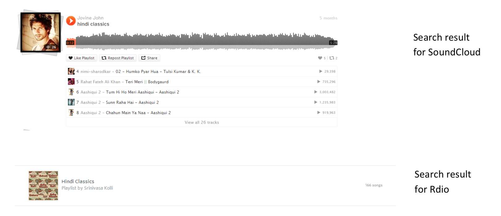
It was easier for him to choose the playlist in case of SoundCloud as the surrogate displayed the sound tracks that were part of the playlist while the surrogate in the case of Rdio, just indicated the number of songs in the playlist.

Criteria Based Evaluation
Effectiveness | In both the tasks, both of the systems were equally effective in fetching the results I was looking for. Though, Rdio took more time to reach to those results, the results in both cases were relevant songs based on my search.
Efficiency | In task 1, as a first time user of the system, SoundCloud was efficient in the amount of time I spent to play the song I was looking though, both the systems required equal number of clicks but as an experienced user, Rdio was very efficient compared to SoundCloud as it required lesser number of clicks and lesser amount of time as well.
In task 2, again SoundCloud was more efficient as it required lesser amount of time than required by Rdio though both systems involved same number of clicks.
The fact that the play button appeared on hovering over the surrogate and the absence of more information in the surrogate, led to more time being taken in case of Rdio.
Mental Effort & Cognitive Load | In both the tasks, SoundCloud involved lesser cognitive load as the navigation over the site was easier to follow and the surrogates were easy to quickly understand.
In case of Rdio, the appearance of play button on hover over the surrogate was not easy to judge, the filters being on the right side of the interface took time to realize on the interface and it was tougher to analyze the surrogates due to lack of more information about the result led to a higher cognitive load and mental effort.
Surrogate Usefulness | Surrogates available in the results differed in case of SoundCloud in both the tasks but were very similar in case of Rdio.
In case of Task 1,The search result comprised of several surrogates in case of SoundCloud while the search result in case of Rdio comprised of very less surrogates. In both cases, the surrogates were useful enough to achieve the goal because of my familiarity with the result (awareness about album cover, artist, etc.)

In case of task 2, the search result comprised of more surrogates in task 2 over SoundCloud wherein it also showed the individual tracks present in the particular playlist result. The surrogates in search result over Rdio were very similar to the one it task one, wherein it just indicated the number of songs in the playlist instead of the time based length on the right side.

The richness in surrogates in the case of SoundCloud made it easier and faster to decide on a playlist than in case of Rdio and hence, in Task 2, surrogates of SoundCloud were more useful than the ones in Rdio.
User Engagement | Though both systems ensured no disruption in performing the task, the user felt higher engagement in case of SoundCloud than in case of Rdio. The ability to easily navigate, play search results and richness of surrogates in search result made it more engaging to use SoundCloud while in case of Rdio, the user had to figure out the search filters, hover on results to play them and surrogates in the search results did not reveal much information.
Conclusion
Both the systems, Rdio and SoundCloud were effective in the search results. Rdio was more efficient in fetching results that were fetched earlier but was lesser efficient in time than SoundCloud in case of first-time search. Though both systems ensure rich user experience and high aesthetic appeal, SoundCloud was more useful, led to lesser cognitive load and was more engaging than Rdio in usage. Hence, I would recommend Soundcloud to be superior than Rdio.